

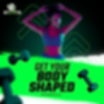
Key Posts Include:
✔ "Build Your Body"
✔ "Start Your Today"
✔ "The Victory Is Yours"
✔ "Up to 15% Off"
Design Notes:
· Gradient overlays & lighting effects to boost visibility
· Directional arrow icons to reinforce motion
· Consistent logo and tagline placement
BRANDING &
SOCIAL MEDIA
01 | THE BRIEF
Hello Fitness is a health and wellness brand focused on helping clients meet their fitness goals through motivation, coaching, and community. The client needed a bold, modern brand identity that could unify digital campaigns, merchandise, and gym touchpoints under one visual language.

02 | THE GOAL
Create a full branding system that:
-
Evokes energy, strength, and personal growth
-
Appeals to all genders and fitness levels
-
Works seamlessly across web, print, social, and merchandise
STRONGER EVERY REP.
CLOSER EVERY STEP.
03 | BRAND STRATEGY
Tag line used consistently across all touchpoint to emphasize results and determination
Core Themes:
✔ Empowerment ✔ Momentum
✔ Inclusivity ✔ Progress
04 | LOGO DESIGN
The logo features two back-to-back silhouettes with weights in hand—representing balance, strength, and diversity. A curved barbell encases the figures, grounding the brand in fitness while creating a recognizable shape for merchandise and print.


Lime Green: Energy + Growth
White: Clarity + Clean Design
Black: Strength & Contrast
05 | SOCIAL MEDIA CAMPAIGN
Developed a bold and unified Instagram presence with scroll-stopping visuals, strong CTAs, and motivational copy.


06 | UX/UI DESIGN
Crafted a clean, branded landing page to match the energy of the campaign. Focused on conversion and accessibility with action-driven CTAs like “Register Now” and “More Info.”
Focus Areas:
· Seamless desktop/mobile UX · Motivational Copy
·Product/Service clarity · Safety imagery for post-pandemic trust

07 | BRANDED GEAR & MERCH
Designed a cohesive suite of custom fitness merchandise. Each item is branded with the Hello Fitness logo, tagline, and directional arrows for movement-themed consistency.

08 | BUSINESS CARDS
Sleek, modern double-sided cards using high-contrast layouts and clean brand typography.


09 | OUTCOME
The Hello Fitness rebrand delivered a powerful identity system that’s:
-
Visually memorable
-
Emotionally motivating
-
Versatile across all touchpoints
This project successfully unified the client’s digital, physical, and promotional materials under one energetic, uplifting brand voice.
10 | TOOLS USED
Adobe Illustrator · Photoshop · XD · Lightroom